
One emblem. Fifty-eight drawings.
From a newspaper impression to a window, a civic identity or a work of art, the letters stay BEND. Their shapes keep changing.
The drawings on file are made in seven different ways, and each way is a family. How alike two drawings look and what they are made of are different questions. This board answers the second; touch a drawing for the first.
Each family shows one picture of every drawing on file, and one more wherever the same drawing was made again in a different way — stitched into knit, cut out of wood, set inside a ring of type. A family stops at twelve pictures; the line under the family says how many there are, and touching a picture lists the rest.
Take the emblem: every file, every format, and what you may do with it.
44 of the 47 pictures here are of a drawing the archive has seen in use somewhere.
Pick a drawing, or two to compare
The angular construction
Broad letters whose corners taper to a point, in every medium that has carried them.
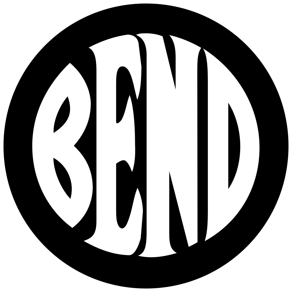
The 1912 cut
Broad letters, a three-armed E, a capital N, and corners that taper to a point.
More about this family
The printing block the Bend Park Company published in July 1912 and the club handed the Bulletin in January 1913. Broad letters to the ring, a three-armed E, a capital N, and corners that taper to a point. Printed again in 1916, and across the section front of the Bulletin’s county fair edition in 1925. The Chamber’s 1953 full page looks like this family at a glance and is not in it: its third letter runs the other way, which is the 1950 re-cut. The Deschutes Historical Museum’s June 2020 drawing was placed here by the curator, and by nothing the matrix reads, on 16 September 2026, as a perfect trace of the original. The matrix reads it as the 1917 rounding and not as this family: its corners turn in a curve where every other drawing here tapers them to a point, and corner form is the one character that tells this family from the 1917 rounding. Both readings stand, which is what this handbook asks for when the instruments disagree.
Needs: The block, or any impression between 1917 and 1952 — and a second reading of the museum’s June 2020 drawing’s corners, which is the character the curator and the matrix disagree about.
6 drawings by 5 holders; all 5 pictures shown
The O’Kane glass
The angular construction worked in glass: narrow came letters standing clear of a double ring, with the B's bowls meeting in a straight join.
More about this family
Narrow letters standing clear of a double ring, drawn in lead over the building’s transoms since 1916, some panes replaced in 1985. The one emblem the public could see every day between 1953 and 2001. The Fred Real Estate Group’s office disc was placed here by the curator, and by nothing the matrix reads, on 16 September 2026, because it is stained glass: a leaded panel of the same blue and white, photographed on an office wall in February 2016, with the came lines crossing the disc in the photograph. That is a grouping on medium and on descent — a glass copy of the O’Kane pane — and it is the second time this family has been made by something other than a character, which is what its own grouping already is. The matrix disagrees and reads it as the Downtown file: enlarged at 91 pixels of letter its B’s two bowls meet in a notch where the transom’s meet in a straight join, and the straight join is the one character that separates this family from every other narrow drawing on file. Both readings stand.
Needs: A square-on photograph of every pane, the 1985 fabrication record, and a photograph of the Fred Real Estate Group’s panel close enough to read the B’s join at the floor the matrix asks for.
Why this family has no drawing
Every other family here is a printed impression. This one is a window: leaded glass, photographed from below in 2012, and it is the only drawing the family has. Flattening it would mean rebuilding three things the photograph does not hold — the circle behind the ellipse, the letters behind the came that cuts through every one of them, and the line between ring and letters where both are the same white glass. Each rebuild works; together they fall below the fidelity this project requires before it will call something a reconstruction. And this family’s whole argument is that five of its letters are shapes leaded came forces — so a clean flat drawing of them would quietly claim the one thing the glass cannot support. The photograph is the right thing to show, until somebody photographs the transoms square on.
2 drawings, seen 3 times by 2 holders; all 2 pictures shown
-
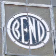 2012 O’Kane Building
 seen 1 time, 2012
-
 2016 Fred Real Estate Group
 seen 2 times, 2016
The 1950 re-cut
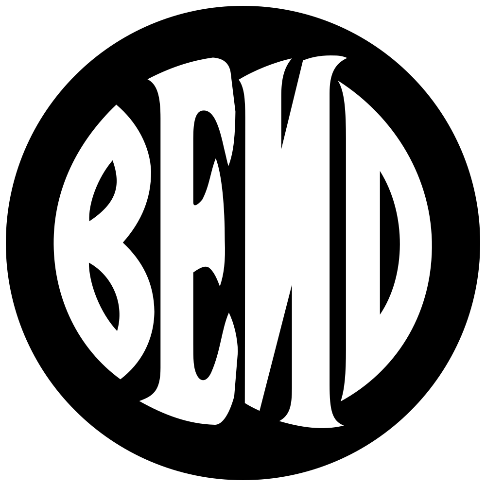
The 1912 cut's broad letters and three-armed E with the third letter mirrored: its diagonal runs from the top right down to the left.
More about this family
The same letters as the 1912 cut with the third one turned round. The Bulletin printed its business directory masthead the ordinary way on Wednesday 15 February 1950 and mirrored on Saturday the 18th, with no directory on the two days between, so the block was replaced inside three days - a new cut rather than a worn one, since wear does not reverse a diagonal. The Chamber of Commerce printed its 1953 full page from this later block, which is why a drawing that looks like the 1912 cut at a glance is not filed with it.
Needs: The window is closed to three days, 15 to 18 February 1950. What is still wanted is anything that says who cut the replacement or why, and a measurement of the new block against the old one rather than a reading of one letter.
2 drawings by 2 holders; all 2 pictures shown
The rounded construction
The same broad letters with corners that turn in a curve.
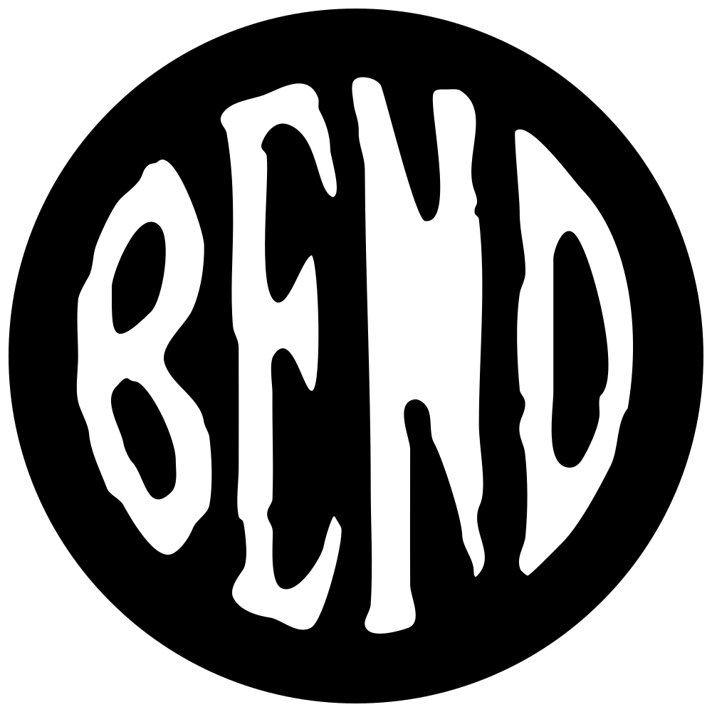
The 1917 rounding
The 1912 cut's broad letters and three-armed E with corners that turn in a curve, and the last letter still tapering to a point.
More about this family
The 1912 cut's letters with their corners rounded, first printed by the Bend Park Company in its own weekly advertisement on 8 February 1917 — the same company that had published the angular cut four and a half years earlier and claimed the brand under it. The construction carries on to the Bulletin's business directory masthead of 1939, 1943 and 1949. Its last letter still tapers, the way every drawing cut as a printing block does. This is also where the letters are first cut out of a solid disc. Every earlier drawing on file is solid letters with a ring drawn around them, the way the July 1912 original has it: the 1912 advertisement and its 1916 reprint both carry a double rule around letters that stand on open ground. The February 1917 advertisement is the earliest dated drawing here whose letters are knocked out of a filled circle, and the June 1917 notice does the same. One caution belongs with it, and it is the reading's own: at the size the advertisement was printed an inner rule two pixels wide would close under a heavy impression, so a disc here means no inner rule survives rather than none was drawn. The museum’s undated printed leaf is the one drawing that cannot be put on either side of February 1917, because nothing dates it more closely than the club’s years. The museum’s September 2020 card is here on nothing the matrix can read — it is nineteen pixels of blur, and it is placed beside the drawing it was published with rather than by a character. Its June 2020 companion was a member of this family until 16 September 2026, when the curator placed it with the 1912 cut as a perfect trace of the original; the matrix still reads it here, on its rounded corners and its tapering last letter.
Needs: Whether the rounding is a second cut or the 1912 block worn and re-inked, and any impression between 1939 and 2012.
7 drawings by 5 holders; all 7 pictures shown


The museum rounding
The same rounded construction as 1917, with the last letter run straight down at one thickness instead of tapering.
More about this family
The 1917 rounding redrawn as artwork rather than cut as a block. The letters are the same and the corners still turn in a curve, but the last one runs straight down at one thickness and stops, where every drawing before 1940 tapers it to a point. Published by the Deschutes Historical Museum since February 2012 and used by Downtown Bend. The Tin Pan Alley painted panel was a member until 16 September 2026, when the curator placed it with the Downtown file on its notched E and B detail and its capital N. The matrix reads it here: its letters are broad and run to a double ring, its E has three arms, and the Downtown file’s are narrow letters standing clear of the ring with a notched E — so letter width and E form both put it in this family and not in that one. Both readings stand.
Needs: The museum's source file and its author, and what it was drawn from.
3 drawings, seen 18 times by 2 holders; all 5 pictures shown
-
 2012 Deschutes Historical Museum
 -
 2018–2026 Downtown Bend Business Association
 seen 16 times, 2022–2026
-
 2022 Downtown Bend Business Association
 the letters alone
seen 1 time, 2022
-
 2025 Downtown Bend Business Association
 the disc without its type
seen 1 time, 2025
-
 undated Downtown Bend Business Association
The notched construction
Narrow letters drawn as simple lines of even weight, with the E and the B both notched at the same height.
The bureau roundel
Narrow letters, a notched E and a notched B at the same height, an arched third letter, and rounded corners.
More about this family
A notched E and a notched B at the same height, and a third letter that arches. First captured in August 2001 on the page of the Chamber’s Visitor and Convention Bureau, standing over the bureau’s own name and address, which is what it is named for. The City’s home page pointed at its own landscape badge from March 2001, four and a half months earlier — but that badge was captured once, on the same August day, and the roundel inside it is about fourteen pixels across and cannot be read as letters at any enlargement. A drawing nobody can read is not a member of a family, and a family is named for its first known member. So the name stands. The City carries the drawing on its own today. The wooden disc behind the council dais joined this family on 16 September 2026, on the curator’s call that it carries the lower-case n — and the matrix, re-read, agrees: enlarged from the January 2026 news photograph at about 134 pixels of letter, the third letter is an arch between two stems with the same spur at its top left that the City’s own 2016 and 2026 files carry, and no diagonal anywhere in it. This archive had it filed as a capital N and as a different construction from the City’s own mark. That reading was wrong, and the council chamber is not carrying a second construction after all. The City’s own 2005 centennial button joined on 16 September 2026, the same day and for the same reason, and it is the arrival that renamed the family next door. The button had been filed that morning with a capital N, and it is the drawing the other family was named for. Enlarged to 121 pixels of letter and set at one height beside the City’s 2016 standalone file and its 2026 mark, its third letter is the arch those two carry, with the same spur above its left stem and no diagonal in it at any enlargement. The curator made the call and the matrix, re-read, agrees. So the City’s centennial mark is the City’s own construction, drawn the way the City draws it, and it sits with the rest of the City’s marks rather than at the head of the commercial line.
Needs: Who drew it, and the City’s adoption record. And a larger capture of the 2005 centennial button: at 121 pixels it is the smallest picture of this construction on file, it barely clears the floor the third letter is read at, and it is the drawing that decided the name of the family beside this one.
15 drawings, seen 23 times by 4 holders; 12 pictures shown of 18
-
 2003 Visit Bend
 -
 2005 City of Bend centennial
 6 drawings · seen 6 times, 2005
-
 2005 City of Bend centennial
 embroidered
seen 1 time, 2005
-
 2005 City of Bend centennial
 in relief
seen 1 time, 2005
-
 2011 City of Bend
 -
 2016 City of Bend
 -
 2018 City of Bend
 seen 1 time, 2018
-
 2019–2024 City of Bend
 seen 3 times, 2023–2024
-
 2023–2026 City of Bend
 1 more artwork · seen 9 times, 2023–2026
-
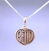 undated The Sunstone Store
 -
 2001 · 5 px Bend Chamber of Commerce
 -
 2002 · 9 px Visit Bend
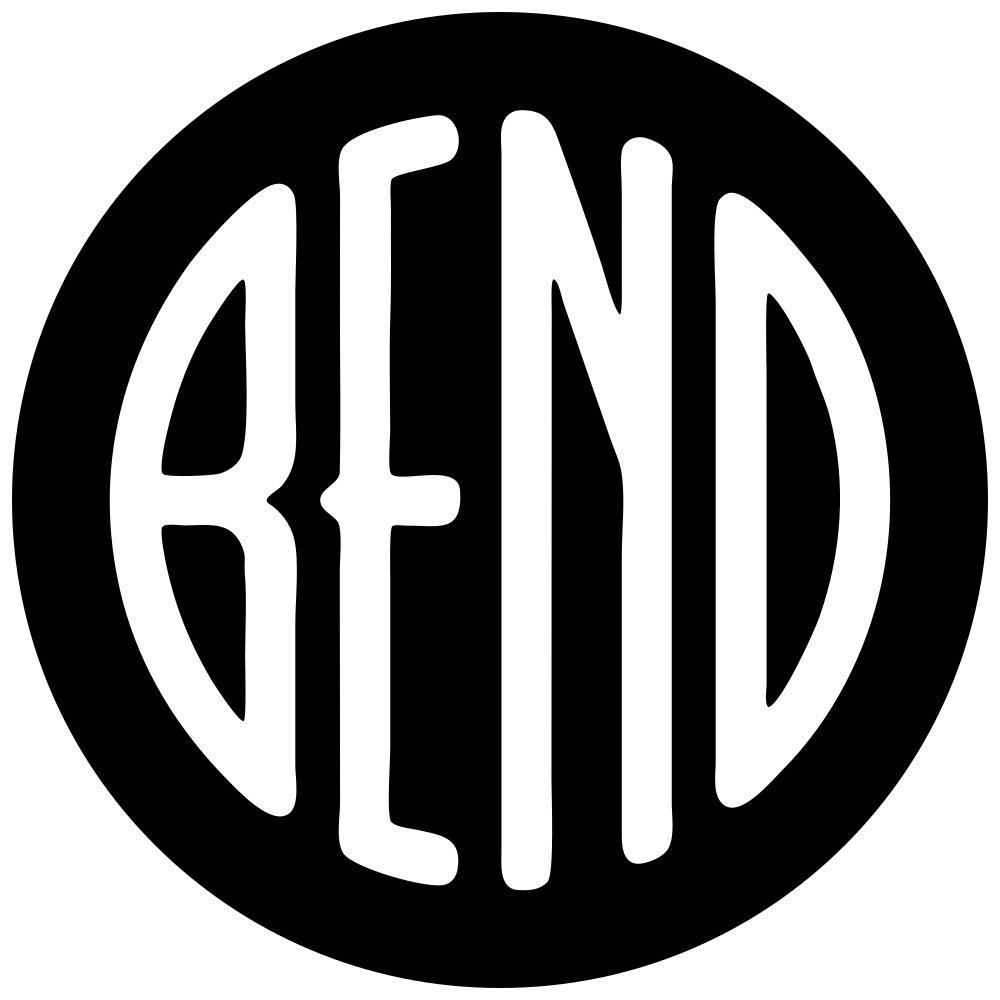
The Downtown file
The same narrow letters and notched E as the bureau roundel, with a capital N.
More about this family
The bureau roundel’s construction with a capital N, and the family where every commercial use of the emblem sits. Downtown Bend’s own file is the earliest of them: 1260 pixels square at 300 dpi, carrying embedded metadata that names Adobe Photoshop CS2 on a Macintosh and a DateTime of 15 November 2006. Since then the construction is on stickers, a brewery’s web page, two trademark filings, a printer’s sign and a shop on Wall Street. Downtown Bend also used the museum drawing, for its 2018 badge. This family has now been named three times, and the rule that moved the name each time is the same one: a family is named for its first known holder, among its members. It was the Downtown file until 16 September 2026, when the City of Bend’s centennial button artwork was read as this construction and dated by its own web capture to 21 November 2005, a year earlier, and it became the centennial button. Later the same day the button’s third letter was read again, at one height beside the City’s 2016 and 2026 files, and it is the arch those two carry rather than a capital N. The character that separates this family from the bureau roundel is that letter, so the button is not a member here at all, and the name came back to Downtown Bend’s 2006 file. The id has never moved: the family is still the-downtown-file in the data, so every URL, anchor, stored key and crop path resolves as it did. A name is what a reader sees, an id is what a link points at, and only the first follows the evidence. Four drawings left this family on 16 September 2026 and two joined it. The council chambers disc and the 2005 button both went to the bureau roundel, and the matrix agrees with both. The Fred Real Estate Group’s office disc went to the O’Kane glass on its medium, and Bend Contracting’s disc to standing alone as a different font; the matrix reads both here still, and each disagreement is written where the drawing now sits. The Tin Pan Alley painted panel joined on the curator’s call, on its notched detail, and the matrix reads it in the museum rounding. The fourteenth member came out of the ledger rather than out of a search: two of The Bend Store’s fifty-eight filed sightings show its disc drawn again by hand, with a wobbling ring and letters of one even weight, and a sighting whose letters are redrawn is a drawing rather than a rendering.
Needs: Who drew the 2006 file, and from what. It is dated by software rather than by a person, and an Exif DateTime is wrong whenever the machine’s clock was, so the family’s own first date rests on one unverifiable field; a dated invoice, brief or proof would replace it. Downtown Bend’s answer to who made its earliest file, and the artwork attached to the 2011 LogoTournament brief, would also show whether the capital N was cut into an existing drawing or drawn with it, which is the question this family and the bureau roundel share.
14 drawings, seen 62 times by 10 holders; 12 pictures shown of 18
-
 2006 Downtown Bend Business Association
 -
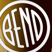 2011 Bend Brew Wear
 -
 2011 Downtown Bend Business Association
 -
 2013 Visit Bend
 2 drawings · seen 1 time, 2013
-
 2014 Visit Bend
 -
 2016 Vintage Bend
 -
 2017–2026 The Bend Store
 2 drawings · 4 more artworks · seen 33 times, 2017–2026
-
 2020–2026 Carstickers.com
 seen 3 times, 2020–2026
-
 2021 Bend Don’t Break It
 -
 undated Bend Rubber Stamp & Printing
 -
 undated Deschutes Brewery
 -
 undated Tin Pan Alley art collection, Bend
Standing alone
2 drawings join none of the 7 families. None of them is evidence of one.
Standing alone
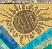
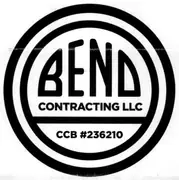
Bend Contracting’s 2021 disc is placed here by the curator, on 16 September 2026, as a different font: the letters are re-set in a geometric sans of even weight and the word sits in the upper third over two lines of type rather than filling the disc. The matrix disagrees and reads it as the Downtown file in all twelve characters — narrow letters clear of the ring, a notched B and a notched E at the same height, a capital N with its diagonal, an even last letter. The disagreement is the record. Painted lettering inside a carved sun; the letters cannot be separated from the surrounding decoration.
2 drawings by 2 holders; all 2 pictures shown
Take the emblem · The archive · How the drawings were measured