
Home / Archive / June 28, 1917
Bend Shevlin Pine, 1917
The Bend Bulletin · June 28, 1917
In the story: 4. Emblematic measles, 1917–1922.
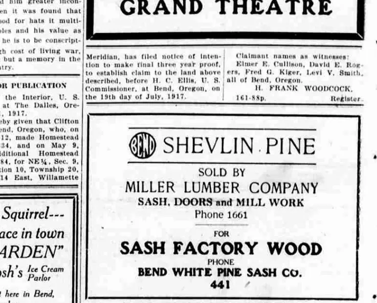
The emblem selling lumber in June 1917, four months later than the record had run.
Page 2 of the Bend Bulletin of 28 June 1917, in a ruled box among the homestead notices and under an advertisement for the Grand Theatre. The emblem is at the head of it, about an inch across, and then the words.
The headline is worth reading carefully, because this record used to transcribe it as “BEND SHEVLIN PINE”. The page does not set the word BEND. It sets the emblem, and then “SHEVLIN PINE” — the device doing the work of the word, in a line a reader completes without being told to. That is what a civic mark is for, and flattening it into type loses the whole of it.
The 1916 article about the O’Kane building already said Shevlin-Hixon was using the emblem on its pine. This is that use with a date on it, and it moves the latest dated impression in the archive from the Bend Emblem Butter advertisement of February 1917 to the end of June.
Four months is not much against a gap that once ran eighty-four years. It is here because the edges of a gap are worth as much as its middle, and because one swept issue produced it: the paper of 28 June 1917 was opened only because it ran sixteen pages where that year’s median was four.
The same box carries a second advertiser below a rule — Bend White Pine Sash Co., for sash factory wood — which is not part of the passage and has no emblem on it.
From the source
SHEVLIN PINE
SOLD BY
MILLER LUMBER COMPANY
SASH, DOORS and MILL WORK
Phone 1661
Measured
The 1917 rounding, the rounded construction. The 1912 cut's broad letters and three-armed E with corners that turn in a curve, and the last letter still tapering to a point.
Read at medium confidence from 99 px of letter, which is an upper bound: this drawing's letters run into its ring, and no cut separates them.
Each drawing is reduced to the same thing — the letters BEND, cropped to their own ink, rasterised at a common size — so two of them can be compared by shape alone.
- Device aspect
- 1.018 The roundel’s width divided by its height. 1.000 is a true circle; anything else is an oval, or a photograph taken at an angle. 0.977 – 1.048 across the collection
- Word aspect
- 1.034 The same ratio for the block of BEND letters alone, once cropped to their own ink. 0.927 – 1.862; the high end is lettering set wide rather than stacked
- Figure ink
- 0.464 How much of the drawing is ink rather than ground. A heavy ring and fat letters push it up. 0.169 – 0.728, median 0.493
- Coverage
- 0.420 How much of the normalised square the letters fill once every drawing is reduced to the same size. 0.198 – 0.576, median 0.456
What it most resembles. Two digitisations of a single printing score 0.975, so that is what “the same artwork” looks like as a number.
- Deschutes County Fair edition, September 1925 0.664 — related letterforms, clearly redrawn
- Bend Park Company, July 1912 0.464 — different drawings
- The same 1912 advertisement, from the page render 0.462 — different drawings
Least like it: Downtown Bend's earlier circle device, 2011, at 0.235.
Resemblance is not descent. A high score means two drawings have the same shape. It does not establish which came first, or that either was copied from the other.
Compare this drawing with another · The board · How the drawings were measured