Home / Archive / February 20, 1917
Bend Emblem Butter
The Bend Bulletin · February 20, 1917
In the story: 4. Emblematic measles, 1917–1922.
Drag to pan. Scroll, pinch, or press + and − to zoom. Esc closes.
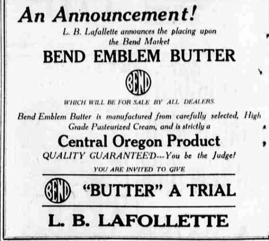
A grocery advertisement, and the emblem printed inside it — twelve days after the company that claimed the brand printed the same mark beside its own address.
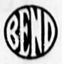
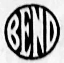
The advertisement prints the emblem twice: a heavy circular rule filled edge to edge by the word BEND in condensed, interlocking capitals, the letters leaning slightly right and conjoined so they span the disc, with the outer strokes of the B and the D running into the ring itself. It ran on February 20 and again on February 21, 1917.
It is a small block: about three eighths of an inch across on the page, printed at the size of a trademark rather than a masthead. Everything that can be said about its drawing has to be said from that.
It ran again the next day, and the block is the same one. Measured on each paper's own native scan, the device is 109 by 113 pixels on February 20 and 110 by 109 on February 21 — the same electrotype, inked a little more heavily the second day, not a fresh setting. Whoever placed the advertisement owned the cut.
This archive has described 1917 to 2000 as its largest gap — the years without a single dated drawing of the letter device, with the earliest afterwards a Chamber of Commerce roundel captured in August 2001. This page falls inside that gap at its very start, and it is a drawing: not a description, not a reference, but the device itself, printed, dated and local.
Set the two side by side. The 2001 file is recorded here as “tall narrow letters filling a ring”. The 1917 block is condensed capitals filling a circular rule. That is the same construction eighty-four years apart, and it is the first physical evidence the project has that the modern roundel's form has an early ancestor rather than a modern invention.
It also puts the emblem on a product five years after the club adopted it and five years before the town did — as a brand name, not a civic badge. Four years later a Redmond creamery would be selling butter in Bend under “the circular Bend emblem”, and the paper would identify that emblem as the Emblem Club's.
From the source
An Announcement! L. B. Lafollette announces the placing upon the Bend Market BEND EMBLEM BUTTER, which will be for sale by all dealers. Bend Emblem Butter is manufactured from carefully selected, High Grade Pasteurized Cream, and is strictly a Central Oregon Product. QUALITY GUARANTEED — You be the Judge! You are invited to give BEND ‘BUTTER’ A TRIAL.
Measured
The 1917 rounding, the rounded construction. The 1912 cut's broad letters and three-armed E with corners that turn in a curve, and the last letter still tapering to a point.
Read at medium confidence from 110 px of letter, which is an upper bound: this drawing's letters run into its ring, and no cut separates them.
Each drawing is reduced to the same thing — the letters BEND, cropped to their own ink, rasterised at a common size — so two of them can be compared by shape alone.
- Device aspect
- 0.983 The roundel’s width divided by its height. 1.000 is a true circle; anything else is an oval, or a photograph taken at an angle. 0.977 – 1.048 across the collection
- Word aspect
- 0.992 The same ratio for the block of BEND letters alone, once cropped to their own ink. 0.927 – 1.862; the high end is lettering set wide rather than stacked
- Figure ink
- 0.506 How much of the drawing is ink rather than ground. A heavy ring and fat letters push it up. 0.169 – 0.728, median 0.493
- Coverage
- 0.399 How much of the normalised square the letters fill once every drawing is reduced to the same size. 0.198 – 0.576, median 0.456
What it most resembles. Two digitisations of a single printing score 0.975, so that is what “the same artwork” looks like as a number.
- BendEmblem.com common master 0.615 — related letterforms, clearly redrawn
- City of Bend Neighborhoods, 2023 0.529 — related letterforms, clearly redrawn
- The City of Bend's current mark 0.501 — related letterforms, clearly redrawn
Least like it: Bulletin business directory, September 1943, at 0.051.
Resemblance is not descent. A high score means two drawings have the same shape. It does not establish which came first, or that either was copied from the other.
Compare this drawing with another · The board · How the drawings were measured