Home / Archive / September 1, 1943
The emblem twice, in the war years
The Bend Bulletin · September 1, 1943
In the story: 6. The emblem outlives the club, 1930–2010.
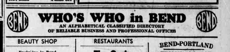
Page seven of a thin wartime Bulletin, the day before Camp Abbot was dedicated, and the emblem is at both ends of the business directory.
The Bend Bulletin of Wednesday 1 September 1943 ran thirty-one pages, which for that year is a long issue. Page seven is classified advertising: rooms to let, cattle at Portland, a Nash dealer asking readers to keep their cars fit for the country, and a page-wide headline over it all reading “Many Can’t Find New Articles And ADVERTISE For Used Ones”. In the lower right corner sits the paper’s own business directory, and the emblem is at each end of its banner.
The banner names itself in three sizes: “WHO’S WHO in BEND” over “AN ALPHABETICAL CLASSIFIED DIRECTORY / OF RELIABLE BUSINESS AND PROFESSIONAL OFFICES”. BEAUTY SHOP, RESTAURANTS and BEND-PORTLAND TRUCK SERVICE are the first three headings underneath, and one of the entries beneath Restaurants tells you what year it is as plainly as the dateline does: “There will be no Chinese food served until further notice.” Beside the directory, a full column congratulates “the builders and U. S. Army Engineers of Camp Abbot”, whose dedication was the following afternoon.
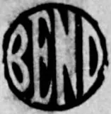
The two impressions are the same block printed twice on one pull, and the pair is worth more than either alone: they show what ink does to this drawing. The left one is loaded. Its ring and the outer edges of its letters have run into each other until the whole device is a disc with four white slivers in it. The right one, six inches away on the same sheet, holds every stroke apart — the B’s two bowls meeting in a notch, the E built on three arms, the last letter tapering to a point at its foot. The families handbook warns that ink weight flips what reads as figure on exactly this masthead. Here both readings are on one page.
The third letter runs the ordinary way in both: its diagonal falls from the top left down to the right. That is the character the archive uses to tell this block from the one the Bulletin put in its place, and the replacement happened between Wednesday 15 and Saturday 18 February 1950. A 1943 impression running the diagonal the ordinary way is what the record predicts, and a record that predicts is worth more than one that only accumulates.
What this page adds is evidence rather than a date. The sweep of 15 September had already confirmed 1 September 1943 as a directory impression and kept it as an address, on the reasoning that twenty-one directory dates are one recurring masthead and each page is two megabytes. That reasoning still holds for the other twenty. What this one now has that an address does not is the bytes, their hashes, two crops at the resolution the provider actually scanned at, and a reading of the letters that can be checked against the picture.
From the source
WHO’S WHO in BEND
AN ALPHABETICAL CLASSIFIED DIRECTORY OF RELIABLE BUSINESS AND PROFESSIONAL OFFICES
Measured
The 1917 rounding, the rounded construction. The 1912 cut's broad letters and three-armed E with corners that turn in a curve, and the last letter still tapering to a point.
Read at medium confidence from 136 px of letter, which is the letters alone, at this drawing's own letter cut.
Each drawing is reduced to the same thing — the letters BEND, cropped to their own ink, rasterised at a common size — so two of them can be compared by shape alone.
- Device aspect
- 0.975 The roundel’s width divided by its height. 1.000 is a true circle; anything else is an oval, or a photograph taken at an angle. 0.977 – 1.048 across the collection
- Word aspect
- 1.000 The same ratio for the block of BEND letters alone, once cropped to their own ink. 0.927 – 1.862; the high end is lettering set wide rather than stacked
- Figure ink
- 0.416 How much of the drawing is ink rather than ground. A heavy ring and fat letters push it up. 0.169 – 0.728, median 0.493
- Coverage
- 0.325 How much of the normalised square the letters fill once every drawing is reduced to the same size. 0.198 – 0.576, median 0.456
What it most resembles. Two digitisations of a single printing score 0.975, so that is what “the same artwork” looks like as a number.
- BendEmblem.com 1912 adaptation 0.515 — related letterforms, clearly redrawn
- Bend Chamber of Commerce, June 1953 0.512 — related letterforms, clearly redrawn
- BendEmblem.com 1912 reference 0.490 — different drawings
Least like it: Bulletin business directory, August 1949, at 0.036.
Resemblance is not descent. A high score means two drawings have the same shape. It does not establish which came first, or that either was copied from the other.
Compare this drawing with another · The board · How the drawings were measured