Home / Archive / August 24, 1949
A new banner, the same emblem
The Bend Bulletin · August 24, 1949
In the story: 6. The emblem outlives the club, 1930–2010.
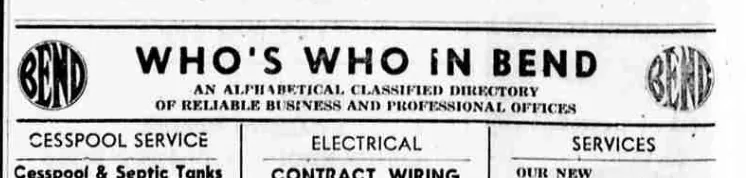
Between 1943 and 1949 the Bulletin reset its directory headline in a plainer face. It kept the device at both ends exactly as it was.
Page twelve of the Bend Bulletin of Wednesday 24 August 1949 is a county fair week page: Powell Butte visiting notes down the left, Blitz Weinhard announcing that its beer is “now in cans!” down the right, payday specials from the Columbia Food Market across the middle. Along the bottom right runs the paper’s business directory, and the emblem is at each end of its banner.
The banner has changed since 1943 and the emblem has not. Where the wartime headline was a fat slab serif, this one is a plain sans-serif — “WHO’S WHO iN BEND”, with a lowercase i in the middle word, which is a compositor’s choice and not a misreading. The two-line strapline underneath is word for word what it was, and the devices at the ends are the same block. Somebody reset the type around a drawing they did not touch.
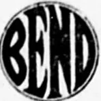
The left impression is the best reading of this block the archive holds after the plate of 1 February 1939. BEND is reversed out of a solid disc in condensed interlocking capitals that fill the circle edge to edge; the B’s bowls meet in a notch, the E is built on three arms, the last letter tapers to its foot, and the third letter’s diagonal falls from the top left. The right impression, four columns away, is over-inked to the point where its counters have closed and nothing can be read off it at all. It is filed because the page carries it.
This date is new. The sweep that enumerated the directory’s run did it by searching cached page text for the banner’s headline and its strapline, and a display face is what optical text is worst at: measured against the dates a person has confirmed by eye, that search recovers nineteen in twenty-four. 24 August 1949 is one of the misses. It turned up instead because the issue is sixty-four pages long, which put it in a sweep of the paper’s outsized issues, and because somebody opened the page the detector pointed at.
What it does not do is extend the run. The directory ran from February 1939 to 29 May 1951 and this date sits inside that, between 3 January 1949 and 3 January 1950, both of which are confirmed. What it adds is a reading of the block in the middle of its life, a banner redesign nobody had noticed, and one more page held as bytes rather than as an address.
From the source
WHO’S WHO iN BEND
AN ALPHABETICAL CLASSIFIED DIRECTORY OF RELIABLE BUSINESS AND PROFESSIONAL OFFICES
Measured
The 1917 rounding, the rounded construction. The 1912 cut's broad letters and three-armed E with corners that turn in a curve, and the last letter still tapering to a point.
Read at medium confidence from 142 px of letter, which is an upper bound: this drawing's letters run into its ring, and no cut separates them.
Each drawing is reduced to the same thing — the letters BEND, cropped to their own ink, rasterised at a common size — so two of them can be compared by shape alone.
- Device aspect
- 1.000 The roundel’s width divided by its height. 1.000 is a true circle; anything else is an oval, or a photograph taken at an angle. 0.977 – 1.048 across the collection
- Word aspect
- 0.997 The same ratio for the block of BEND letters alone, once cropped to their own ink. 0.927 – 1.862; the high end is lettering set wide rather than stacked
- Figure ink
- 0.330 How much of the drawing is ink rather than ground. A heavy ring and fat letters push it up. 0.169 – 0.728, median 0.493
- Coverage
- 0.259 How much of the normalised square the letters fill once every drawing is reduced to the same size. 0.198 – 0.576, median 0.456
What it most resembles. Two digitisations of a single printing score 0.975, so that is what “the same artwork” looks like as a number.
- Bend Emblem Butter, February 1917 0.486 — different drawings
- Bend Shevlin Pine, June 1917 0.335 — different drawings
- Deschutes County Fair edition, September 1925 0.324 — different drawings
Least like it: Bulletin business directory, September 1943, at 0.036.
Resemblance is not descent. A high score means two drawings have the same shape. It does not establish which came first, or that either was copied from the other.
Compare this drawing with another · The board · How the drawings were measured