Home / Archive / September 19, 1925
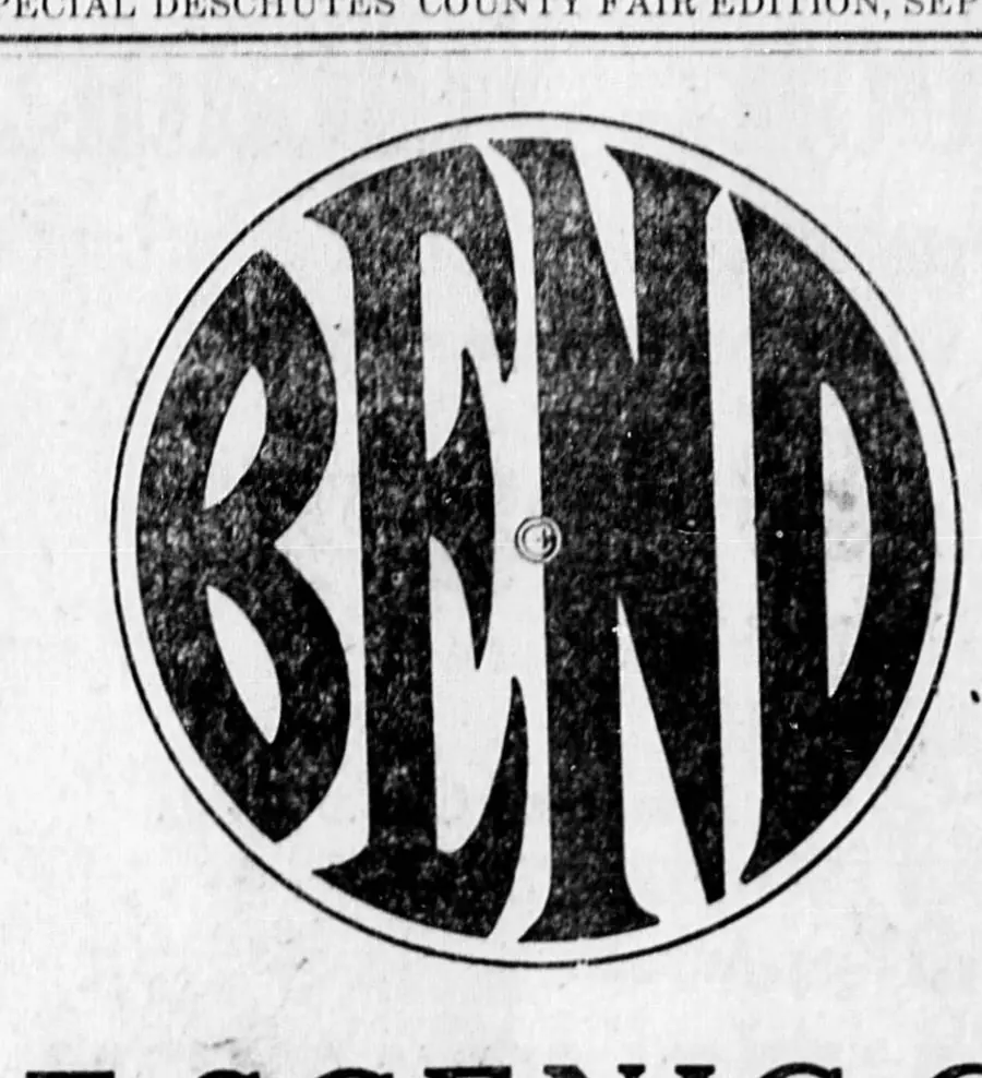
The emblem made of forest, 1925
The Bend Bulletin · September 19, 1925
In the story: 5. For the use of all, 1923–1929.
Two and a half inches of it on a fair edition’s section front, with its letters cut out of a photograph of timber.
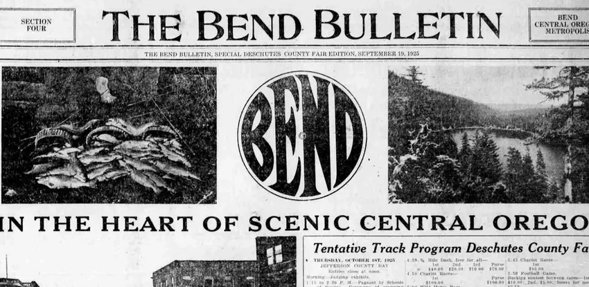
Section Four of the Bend Bulletin’s Special Deschutes County Fair Edition, 19 September 1925. The flag reads “SECTION FOUR” at the left, “THE BEND BULLETIN” across the middle and “BEND CENTRAL OREGON METROPOLIS” at the right, with the edition’s own dateline in small capitals under it. Then a band of three pictures: a catch of fish on the left, a lake on the right, and the emblem between them. The strapline runs underneath all three. The two lines set apart below are the dateline and the strapline; they are not contiguous type, and the pictures — including the emblem — are what runs between them.
The emblem is about 790 pixels across on the scan — two and a half inches printed, more than twice the size of any other impression this archive holds. And it is not printed in ink. The letters are knocked out of a halftone photograph of timbered country, so BEND reads as forest inside a thin ruled circle. Nothing else in the collection is made that way.
It matters most for where it sits. This archive described the years between the emblem’s last dated drawing and its next as its largest gap, and for a long time that gap ran from 1917 to 2001 with nothing in it. This is the earliest impression found inside it, and it is not a small or grudging one: the town’s newspaper put the mark two and a half inches wide on the front of a section about the county fair, eight years after the record had gone quiet.
It was found by machine. A detector swept all thirty-nine pages of the issue and proposed twelve round things; this was the sixth of them, scored 0.42, below two automobile-tyre badges and a star. The score is not the finding. A person opening the page is the finding, and that is the only reason this tool is allowed to exist.
It is measured now, and the number is oddly quiet: 0.591 against the 1912 advertisement, moving with the cut rather than holding. That is what a halftone does to a shape measurement — the mask is a photograph, not a letter. The eye does better here than the arithmetic, and the eye notices something the arithmetic cannot reach: both this device and the 1912 one carry a small ring mark at the exact centre, in the same place, and nothing else on file does.
From the source
THE BEND BULLETIN, SPECIAL DESCHUTES COUNTY FAIR EDITION, SEPTEMBER 19, 1925
IN THE HEART OF SCENIC CENTRAL OREGON
Measured
The 1912 cut, the angular construction. Broad letters, a three-armed E, a capital N, and corners that taper to a point.
Read at high confidence from 766 px of letter, which is an upper bound: this drawing's letters run into its ring, and no cut separates them.
Each drawing is reduced to the same thing — the letters BEND, cropped to their own ink, rasterised at a common size — so two of them can be compared by shape alone.
- Device aspect
- 0.988 The roundel’s width divided by its height. 1.000 is a true circle; anything else is an oval, or a photograph taken at an angle. 0.977 – 1.048 across the collection
- Word aspect
- 1.003 The same ratio for the block of BEND letters alone, once cropped to their own ink. 0.927 – 1.862; the high end is lettering set wide rather than stacked
- Figure ink
- 0.659 How much of the drawing is ink rather than ground. A heavy ring and fat letters push it up. 0.169 – 0.728, median 0.493
- Coverage
- 0.517 How much of the normalised square the letters fill once every drawing is reduced to the same size. 0.198 – 0.576, median 0.456
What it most resembles. Two digitisations of a single printing score 0.975, so that is what “the same artwork” looks like as a number.
- Bend Shevlin Pine, June 1917 0.664 — related letterforms, clearly redrawn
- Bend Park Company, July 1912 0.591 — related letterforms, clearly redrawn
- The same 1912 advertisement, from the page render 0.588 — related letterforms, clearly redrawn
Least like it: Bend Rubber Stamp & Printing, at 0.235.
Resemblance is not descent. A high score means two drawings have the same shape. It does not establish which came first, or that either was copied from the other.
Compare this drawing with another · The board · How the drawings were measured