
The emblem at the print shop
Bend Rubber Stamp & Printing · Undated
This record carries no date and is not plotted along the story. The archive holds it.
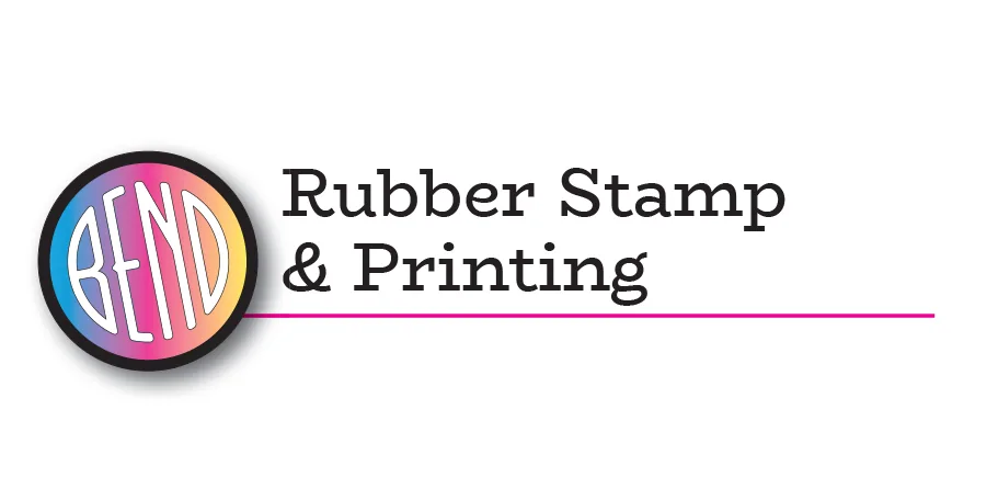
A local printer makes the Bend emblem part of its name.
Bend Rubber Stamp & Printing places the narrow, rounded Bend letters in a tilted circle, with a band of color behind them. The device forms the first word of the company’s identity.
Its lettering provides another comparison for Bend Brew Wear, Visit Bend and the Bend Store. The printer’s website describes a business history reaching back to 1970; that does not date this logo. A preserved printing block, old letterhead or designer’s file could help connect its earlier forms.
Measured
The Downtown file, the notched construction. The same narrow letters and notched E as the bureau roundel, with a capital N.
Read at medium confidence from 146 px of letter, which is the letters alone, at this drawing's own letter cut.
Each drawing is reduced to the same thing — the letters BEND, cropped to their own ink, rasterised at a common size — so two of them can be compared by shape alone.
- Device aspect
- 1.000 The roundel’s width divided by its height. 1.000 is a true circle; anything else is an oval, or a photograph taken at an angle. 0.977 – 1.048 across the collection
- Word aspect
- 0.927 The same ratio for the block of BEND letters alone, once cropped to their own ink. 0.927 – 1.862; the high end is lettering set wide rather than stacked
- Figure ink
- 0.169 How much of the drawing is ink rather than ground. A heavy ring and fat letters push it up. 0.169 – 0.728, median 0.493
- Coverage
- 0.198 How much of the normalised square the letters fill once every drawing is reduced to the same size. 0.198 – 0.576, median 0.456
What it most resembles. Two digitisations of a single printing score 0.975, so that is what “the same artwork” looks like as a number.
- Bend Brew Wear contest entry, 2011 0.306 — different drawings
- Bend Shevlin Pine, June 1917 0.248 — different drawings
- Modernisation reference made with ChatGPT, 2026 0.246 — different drawings
Least like it: The bureau’s roundel in 2003, at 0.137.
Resemblance is not descent. A high score means two drawings have the same shape. It does not establish which came first, or that either was copied from the other.
Compare this drawing with another · The board · How the drawings were measured