
Home / Archive / September 10, 2026
A modernisation reference, 2026
Grayson Graham collection · September 10, 2026
In the story: 8. Carrying it forward, since 2022.
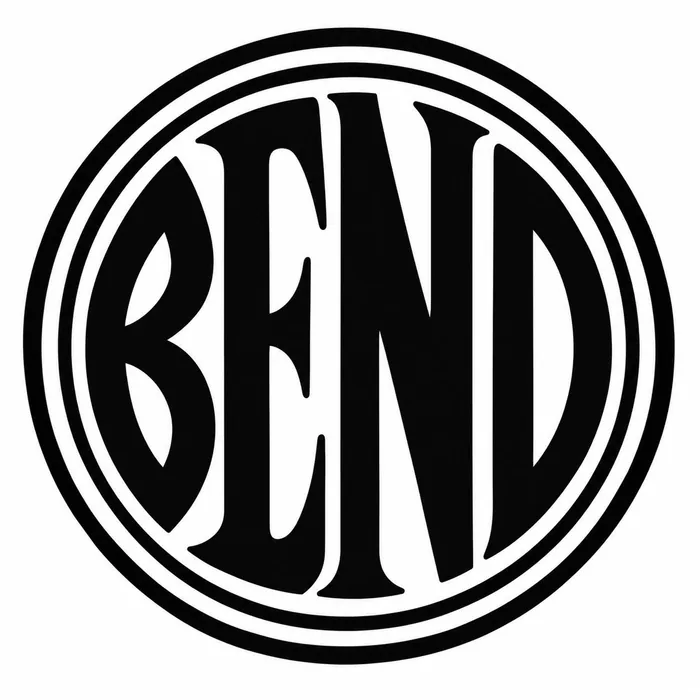
A picture of the emblem made with ChatGPT and supplied to this project as a reference for the modern adaptation. It is a reference and not evidence: it says nothing about where any historical drawing came from.
This file arrived on 10 September 2026 with the approval of the carry-forward proposal, as an illustration of the direction a cleaned-up drawing might take. Its bytes are preserved exactly as received — no crop, no cleanup, no tracing, no recompression — and the accession note beside them records what it is and what it is not.
It is measured, and it is measured for one reason: to test what the file says about itself. Reading it beside the native 1912 newspaper crop shows two heavy detached circular strokes, broad smooth letters, a narrow pointed upper B counter and prominent flared terminals, where the 1912 impression has a much thinner outer outline around the white perimeter channel. Calling both a double ring would hide a visible difference.
Nothing here is a historical claim. The image was made in 2026 by a person using a tool, and a drawing made in 2026 is not testimony about 1912. No chapter cites it, and it is not one of the seven families; it sits with the references, which are kept for comparison and never used as evidence.
Measured
Read at high confidence from 1143 px of letter, which is an upper bound: this drawing's letters run into its ring, and no cut separates them.
Each drawing is reduced to the same thing — the letters BEND, cropped to their own ink, rasterised at a common size — so two of them can be compared by shape alone.
- Device aspect
- 1.022 The roundel’s width divided by its height. 1.000 is a true circle; anything else is an oval, or a photograph taken at an angle. 0.977 – 1.048 across the collection
- Word aspect
- 1.019 The same ratio for the block of BEND letters alone, once cropped to their own ink. 0.927 – 1.862; the high end is lettering set wide rather than stacked
- Figure ink
- 0.615 How much of the drawing is ink rather than ground. A heavy ring and fat letters push it up. 0.169 – 0.728, median 0.493
- Coverage
- 0.489 How much of the normalised square the letters fill once every drawing is reduced to the same size. 0.198 – 0.576, median 0.456
What it most resembles. Two digitisations of a single printing score 0.975, so that is what “the same artwork” looks like as a number.
- Carstickers.com BEND sticker 0.522 — related letterforms, clearly redrawn
- Bend Chamber of Commerce, June 1953 0.515 — related letterforms, clearly redrawn
- The same 1912 advertisement, from the page render 0.509 — related letterforms, clearly redrawn
Least like it: Bend Rubber Stamp & Printing, at 0.246.
Resemblance is not descent. A high score means two drawings have the same shape. It does not establish which came first, or that either was copied from the other.
Compare this drawing with another · The board · How the drawings were measured