Home / Archive / July 25, 2020
Six years of one sticker
Carstickers.com · July 25, 2020
In the story: 7. They got there, 2011–2021.
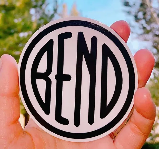
A Bend sticker company has been selling the same emblem sticker since 2020, and photographed it three times.
Carstickers.com is a Bend business that prints stickers and decals, and among the 1,588 posts on its Instagram account it has shown a BEND disc three times: a promotional graphic in July 2020, the physical sticker held in a hand against pines and snow in March 2021, and a water bottle in a snowbank in July 2026, testing how well the vinyl holds up. Every one is the same product.
The deliverable that found these called the drawing an “arched-capitals” family of its own, on the strength of the letters' rounded tops and bottoms. Read against the matrix here it is not a new family: narrow letters standing clear of a heavy ring, a notched B, a notched E at the same height, a capital N running the ordinary way and a last letter that runs down at one thickness. That is the Downtown file's construction. What is different is the ring, which is heavy where the Downtown file's is usually thin — and the ring is a treatment, recorded per drawing and never used to separate one family from another.
The sticker is also the cleanest modern rendering of that construction in this archive: printed vinyl, photographed close, in focus.
Measured
The Downtown file, the notched construction. The same narrow letters and notched E as the bureau roundel, with a capital N.
Read at high confidence from 407 px of letter, which is an upper bound: this drawing's letters run into its ring, and no cut separates them.
Each drawing is reduced to the same thing — the letters BEND, cropped to their own ink, rasterised at a common size — so two of them can be compared by shape alone.
- Device aspect
- 1.000 The roundel’s width divided by its height. 1.000 is a true circle; anything else is an oval, or a photograph taken at an angle. 0.977 – 1.048 across the collection
- Word aspect
- 1.032 The same ratio for the block of BEND letters alone, once cropped to their own ink. 0.927 – 1.862; the high end is lettering set wide rather than stacked
- Figure ink
- 0.459 How much of the drawing is ink rather than ground. A heavy ring and fat letters push it up. 0.169 – 0.728, median 0.493
- Coverage
- 0.371 How much of the normalised square the letters fill once every drawing is reduced to the same size. 0.198 – 0.576, median 0.456
What it most resembles. Two digitisations of a single printing score 0.975, so that is what “the same artwork” looks like as a number.
- Modernisation reference made with ChatGPT, 2026 0.522 — related letterforms, clearly redrawn
- The City’s roundel alone, 2016 0.477 — different drawings
- Grayson Graham collection, black, 2022 0.447 — different drawings
Least like it: BendEmblem.com common master, at 0.191.
Resemblance is not descent. A high score means two drawings have the same shape. It does not establish which came first, or that either was copied from the other.
Compare this drawing with another · The board · How the drawings were measured
Seen in use
3 dated sightings, 2020–2026. Each is a record of this object or this drawing somewhere else, and where a picture is hosted it is a documentary crop of the object, credited to whoever holds it.
-
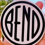
 July 25, 2020 Carstickers.com · Promotional graphic for the company’s BEND circle sticker Digital graphic · instagram.com Carstickers.com; documentary reproduction at documentary size for commentary, with attribution and a link. Source: https://www.instagram.com/p/CDFTsByByQa/
 -
 March 5, 2021 Carstickers.com · A white circular vinyl sticker held in a hand, outdoors Photograph of the object · instagram.com Carstickers.com; documentary reproduction at documentary size for commentary, with attribution and a link. Source: https://www.instagram.com/p/CMDiTuqBvGn/
 -
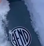
 July 2, 2026 Carstickers.com · A circular vinyl sticker on a water bottle, set in snow to test how it holds Photograph of the object · instagram.com Carstickers.com; documentary reproduction at documentary size for commentary, with attribution and a link. Source: https://www.instagram.com/reel/DaTp9NLJ0Ar/