The emblem in print, 1912
The Bend Bulletin · July 3, 1912
In the story: 1. A city of two thousand, to 1912.
Drag to pan. Scroll, pinch, or press + and − to zoom. Esc closes.
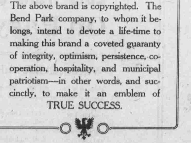
A whole page of the Bend Bulletin, bought and left almost empty: the emblem alone, eight lines of type, and a printer’s ornament.
Page six of the Bend Bulletin for Wednesday, 3 July 1912, inside a double rule with ornamental blocks at its corners. In the upper third, the emblem — a disc with BEND reversed out of it, a fifth of the page across and still small against all that space. Below it, eight lines of type in a ruled frame that opens at the top and bottom like a bracket, with a printer’s stock ornament at its foot. Then nothing.
That emptiness is the argument. Every other page of this paper is packed to the rules with type; a page of white space in a 1912 weekly is the most expensive thing on sale. There is no street address on it, no price, no lots, no product and no company name outside the notice itself. The Bend Park Company bought a page to show one drawing and say one thing about it.
The thing it says is worth reading closely, because the word it uses is “brand”. The above brand is copyrighted; the company intends to devote a lifetime to making this brand a coveted guaranty of integrity, optimism, persistence, co-operation, hospitality and municipal patriotism. Only in the last clause does the other word arrive — “in other words, and succinctly, to make it an emblem of TRUE SUCCESS.” An emblem is what the brand is meant to become, not what it is called.
Six qualities, and not one of them about land. A company selling subdivisions bought a page to promise a lifetime of integrity, optimism, persistence, co-operation, hospitality and municipal patriotism. Three weeks later the same company had the emblem lit up in blue and gold across the back of a booth in Seattle, and the Bulletin named the Emblem Club for the first time. The club’s first annual dinner was more than six months away.
This newspaper impression is the source for the historical reconstruction on this site, and the control against which every other drawing here is measured.
From the source
The above brand is copyrighted. The Bend Park company, to whom it belongs, intend to devote a life-time to making this brand a coveted guaranty of integrity, optimism, persistence, co-operation, hospitality, and municipal patriotism — in other words, and succinctly, to make it an emblem of TRUE SUCCESS.
Measured
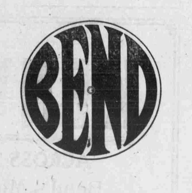
The 1912 cut, the angular construction. Broad letters, a three-armed E, a capital N, and corners that taper to a point.
Read at high confidence from 911 px of letter, which is an upper bound: this drawing's letters run into its ring, and no cut separates them.
Each drawing is reduced to the same thing — the letters BEND, cropped to their own ink, rasterised at a common size — so two of them can be compared by shape alone.
- Device aspect
- 1.011 The roundel’s width divided by its height. 1.000 is a true circle; anything else is an oval, or a photograph taken at an angle. 0.977 – 1.048 across the collection
- Word aspect
- 1.005 The same ratio for the block of BEND letters alone, once cropped to their own ink. 0.927 – 1.862; the high end is lettering set wide rather than stacked
- Figure ink
- 0.728 How much of the drawing is ink rather than ground. A heavy ring and fat letters push it up. 0.169 – 0.728, median 0.493
- Coverage
- 0.571 How much of the normalised square the letters fill once every drawing is reduced to the same size. 0.198 – 0.576, median 0.456
What it most resembles. Two digitisations of a single printing score 0.975, so that is what “the same artwork” looks like as a number.
- The same 1912 advertisement, from the page render 0.975 — at or above the control — indistinguishable from one printing digitised twice
- The Bend Bulletin, November 1916 0.930 — very close; the same drawing, or one traced from it
- BendEmblem.com 1912 reference 0.888 — a family resemblance, not the same cut
Least like it: Bulletin business directory, August 1949, at 0.171.
Resemblance is not descent. A high score means two drawings have the same shape. It does not establish which came first, or that either was copied from the other.
Ties touching this drawing, each in the class of evidence it has:
- Documented Traced. Traced from the July 3 newspaper specimen, with the documented central-detail omission.
- Documented Redrawn. A new drawing based on the 1912 specimen, with deliberate optical changes.
- A question Redrawn for the Chamber?. The Chamber’s 1953 emblem scores about 0.69 against both period impressions at every cut: the same family, far below the 0.975 control, so a redrawing rather than the same block. Whether whoever drew it had an impression in front of them is unknown. What would settle it: Part of this has now been run: the Bulletin’s outsized editions were swept for round devices and the paper’s own 1939 directory masthead came out of it, which is a surviving impression in the gap and measures far closer to 1912 than the Chamber’s drawing does. What remains is the sweep’s unopened middle — about 170 outsized issues between 1917 and 1952 are still unswept, and the directory’s own run is sampled at nine dates out of roughly 1,700 — and, for this edge specifically, anything that puts a drawing in the Chamber’s hands rather than the newspaper’s.
- A question Redrawn from the 1912 or 1916 cut?. Every character of the museum’s drawing matches the period impressions - three-armed E, capital N, letters to the edge - and none matches the narrow families. It scores 0.70 against the 1912 cut, which is family rather than copy. What would settle it: The Deschutes Historical Museum’s source file and its author, asked of the museum directly. A working file with a 1912 or 1916 scan under it would settle a direction the measurement cannot, and the museum is the first known holder.
- Measured 0.88, steady at every cut. The 1939 directory masthead scores 0.8825 to 0.8916 against the July 1912 advertisement across every device cut — a spread of 0.009, the tightest any pair inside the 1917 to 2001 gap has held. The same-artwork band here is the 0.975 control and the 0.930 the 1916 reprint reaches, so this is the construction and not the block: a drawing of the same letters, not an impression of the same cut.
Compare this drawing with another · The board · How the drawings were measured
Measured · The same 1912 advertisement, from the page render
The 1912 cut, the angular construction. Broad letters, a three-armed E, a capital N, and corners that taper to a point.
Read at high confidence from 455 px of letter, which is an upper bound: this drawing's letters run into its ring, and no cut separates them.
Each drawing is reduced to the same thing — the letters BEND, cropped to their own ink, rasterised at a common size — so two of them can be compared by shape alone.
- Device aspect
- 1.015 The roundel’s width divided by its height. 1.000 is a true circle; anything else is an oval, or a photograph taken at an angle. 0.977 – 1.048 across the collection
- Word aspect
- 1.011 The same ratio for the block of BEND letters alone, once cropped to their own ink. 0.927 – 1.862; the high end is lettering set wide rather than stacked
- Figure ink
- 0.724 How much of the drawing is ink rather than ground. A heavy ring and fat letters push it up. 0.169 – 0.728, median 0.493
- Coverage
- 0.576 How much of the normalised square the letters fill once every drawing is reduced to the same size. 0.198 – 0.576, median 0.456
What it most resembles. Two digitisations of a single printing score 0.975, so that is what “the same artwork” looks like as a number.
- Bend Park Company, July 1912 0.975 — at or above the control — indistinguishable from one printing digitised twice
- The Bend Bulletin, November 1916 0.936 — very close; the same drawing, or one traced from it
- BendEmblem.com 1912 reference 0.895 — a family resemblance, not the same cut
Least like it: Bulletin business directory, August 1949, at 0.169.
Resemblance is not descent. A high score means two drawings have the same shape. It does not establish which came first, or that either was copied from the other.
Compare this drawing with another · The board · How the drawings were measured
See the historical reconstruction