Home / Archive / November 22, 1916
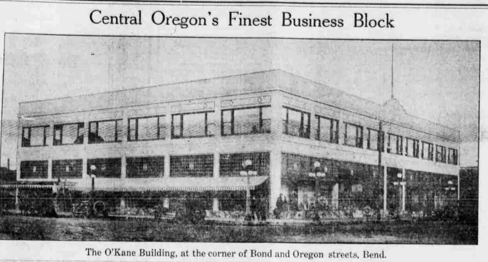
The new O’Kane Building
The Bend Bulletin · November 22, 1916
In the story: 3. Wearing the promise, 1914–1916.
Drag to pan. Scroll, pinch, or press + and − to zoom. Esc closes.
A broad photograph of the O’Kane Building accompanies reports of its tenants, construction and decorative glass.
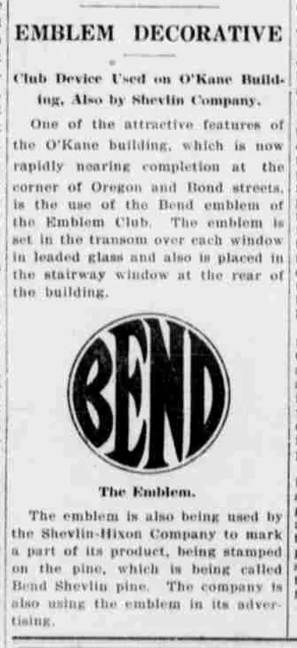
A photograph of the new building filled the top of page nine under the head “Central Oregon’s Finest Business Block”, and lower in the same column the Bulletin reprinted, whole, the emblem item it had run three weeks earlier.
It carries no passage here on purpose. The words belong to the original of 1 November, which is filed and quoted, and a second copy would be a worse one.
What only this page can show is the reprint itself. The text is identical and the headline is not: the original is set “EMBLEM IS DECORATIVE” and this one drops the verb to “EMBLEM DECORATIVE”, which is a compositor fitting a wider column’s head into a narrower one. The emblem is printed again, from the same block.
So the O’Kane glass and the Shevlin pine were worth saying twice in a month, in a paper that came out once a week.
Measured
The 1912 cut, the angular construction. Broad letters, a three-armed E, a capital N, and corners that taper to a point.
Read at high confidence from 338 px of letter, which is an upper bound: this drawing's letters run into its ring, and no cut separates them.
Each drawing is reduced to the same thing — the letters BEND, cropped to their own ink, rasterised at a common size — so two of them can be compared by shape alone.
- Device aspect
- 1.014 The roundel’s width divided by its height. 1.000 is a true circle; anything else is an oval, or a photograph taken at an angle. 0.977 – 1.048 across the collection
- Word aspect
- 1.013 The same ratio for the block of BEND letters alone, once cropped to their own ink. 0.927 – 1.862; the high end is lettering set wide rather than stacked
- Figure ink
- 0.711 How much of the drawing is ink rather than ground. A heavy ring and fat letters push it up. 0.169 – 0.728, median 0.493
- Coverage
- 0.566 How much of the normalised square the letters fill once every drawing is reduced to the same size. 0.198 – 0.576, median 0.456
What it most resembles. Two digitisations of a single printing score 0.975, so that is what “the same artwork” looks like as a number.
- The same 1912 advertisement, from the page render 0.936 — very close; the same drawing, or one traced from it
- Bend Park Company, July 1912 0.930 — very close; the same drawing, or one traced from it
- BendEmblem.com 1912 reference 0.877 — a family resemblance, not the same cut
Least like it: Bulletin business directory, August 1949, at 0.157.
Resemblance is not descent. A high score means two drawings have the same shape. It does not establish which came first, or that either was copied from the other.
Compare this drawing with another · The board · How the drawings were measured