Home / Archive / December 23, 2025
The City's mark today
City of Bend · December 23, 2025
In the story: 8. Carrying it forward, since 2022.

One drawing and four lockups: what the City of Bend is actually using in 2026.
The archive's newest City mark before this was the neighborhood artwork of May 2023. This record is what a look in 2026 finds: four logo files the City is serving now, pulled from the sites that carry them.
The horizontal colour file sets a cream disc with a heavy black ring beside CITY OF BEND, and is the one a radio station reused in a December 2025 news story. The Water Services lockup stacks CITY OF BEND / WATER SERVICES under the same disc. The permits portal carries a plain version. And a fourth file, which the City named a night logo, is the same drawing as an outline in dark blue on transparency — filled nowhere, so what it looks like depends entirely on what it is laid over. The copy read here is not on a City site at all: it is hosted by Camp Fire Central Oregon, a Bend organisation that publishes the City's file alongside its own, which is how a mark travels and is worth saying in a record about what the City is using.
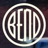
The drawing under all four is one drawing, and it is the bureau roundel — the construction first seen on the Chamber of Commerce's website in August 2001, named for its first known holder rather than its most visible one. Narrow letters clear of the ring, a notched B and a notched E at the same height, and the arched third letter the City calls the “Bend bug”.
Measured
The bureau roundel, the notched construction. Narrow letters, a notched E and a notched B at the same height, an arched third letter, and rounded corners.
Read at high confidence from 158 px of letter, which is the letters alone, at this drawing's own letter cut.
Each drawing is reduced to the same thing — the letters BEND, cropped to their own ink, rasterised at a common size — so two of them can be compared by shape alone.
- Device aspect
- 1.000 The roundel’s width divided by its height. 1.000 is a true circle; anything else is an oval, or a photograph taken at an angle. 0.977 – 1.048 across the collection
- Word aspect
- 1.000 The same ratio for the block of BEND letters alone, once cropped to their own ink. 0.927 – 1.862; the high end is lettering set wide rather than stacked
- Figure ink
- 0.482 How much of the drawing is ink rather than ground. A heavy ring and fat letters push it up. 0.169 – 0.728, median 0.493
- Coverage
- 0.377 How much of the normalised square the letters fill once every drawing is reduced to the same size. 0.198 – 0.576, median 0.456
What it most resembles. Two digitisations of a single printing score 0.975, so that is what “the same artwork” looks like as a number.
- Deschutes Brewery, Born in Bend 0.811 — a family resemblance, not the same cut
- City of Bend Neighborhoods, 2023 0.800 — a family resemblance, not the same cut
- The centennial button, 2005 0.731 — related letterforms, clearly redrawn
Least like it: Bend Rubber Stamp & Printing, at 0.185.
Resemblance is not descent. A high score means two drawings have the same shape. It does not establish which came first, or that either was copied from the other.
Compare this drawing with another · The board · How the drawings were measured
Seen in use
15 dated sightings, 2021–2026. Each is a record of this object or this drawing somewhere else, and where a picture is hosted it is a documentary crop of the object, credited to whoever holds it.
- February 4, 2021 City of Bend · The City's avatar in a Black History Month ring reading CELEBRATING BLACK HISTORY MONTH / FEBRUARY 2021 Facebook profile picture · facebook.com The City's Facebook avatar has been a campaign variant of the emblem since at least this date, four years before the logo files this record is dated by.
- June 3, 2021 City of Bend · The City's avatar in a rainbow ring for Pride Facebook profile picture · facebook.com
- September 21, 2021 City of Bend · The City's plain avatar: the emblem cream on black, no campaign ring Facebook profile picture · facebook.com
-
 November 28, 2023 KTVZ NewsChannel 21 · The City’s circular logo beside CITY OF BEND, in a news graphic about drinking water Digital graphic · instagram.com KTVZ NewsChannel 21; documentary reproduction at documentary size for commentary, with attribution and a link. Source: https://www.instagram.com/p/C0NguzwNarw/
 - October 29, 2024 KTVZ NewsChannel 21 · The City’s circular logo beside CITY OF BEND, in the corner of a planning map Digital graphic · instagram.com
- December 23, 2025 City of Bend · “Franklin Avenue is now open” project announcement Digital graphic · facebook.com
-
 January 1, 2026 City of Bend · The night-logo file, as Camp Fire Central Oregon publishes it Official logo file · campfireco.org The file is the City’s and the copy read here is not on a City site: Camp Fire Central Oregon publishes it. The upload path carries a month and not a day, so the first of the month is a placeholder and the record says so. Filed as the City's night file and read here as a recolour rather than as the inverse: the crop is a navy emblem on a green ground, not the light-on-dark artwork the City distributes. It carries no rendering, which on this ledger means the drawing's plain one. City of Bend; documentary reproduction at documentary size for commentary, with attribution and a link. Source: https://campfireco.org/wp-content/uploads/2026/01/COB-Vertical-Night-Logo-740x493.png
 -
 February 16, 2026 City of Bend · Corner watermark over public-safety-campus reel footage Digital graphic, as a video watermark · instagram.com City of Bend; documentary reproduction at documentary size for commentary, with attribution and a link. Source: https://www.instagram.com/reel/DU0q-jHksr2/
 -
 March 2, 2026 City of Bend · Water Services lockup: the disc over CITY OF BEND / WATER SERVICES Official logo file · dehayf5mhw1h7.cloudfront.net Filed with a `night` rendering on 16 September 2026 and withdrawn the same day. This record's own findings say the City's night logo is the drawing as an outline on transparency, which takes the colour of whatever it is placed on: a cream disc on a black lockup is that file on a black ground, not a second artwork. The rendering key counts an inversion only where the holder publishes the inverse itself. City of Bend; documentary reproduction at documentary size for commentary, with attribution and a link. Source: https://dehayf5mhw1h7.cloudfront.net/wp-content/uploads/sites/1950/2026/03/02204135/bend_water_services981441.png
 -
 April 15, 2026 City of Bend · Wilson Avenue Corridor project map, the disc at its foot beside a go-bond seal Digital graphic · facebook.com City of Bend; documentary reproduction at documentary size for commentary, with attribution and a link. Source: https://www.facebook.com/CityofBendOregon/posts/pfbid02cqzLCSmDjL5JB9FSCd8CjzsX4i4q5vDjzhEQRvroKmSVeVEGUDKhTUwHHXh6JVful
 -
 June 29, 2026 City of Bend · “Fireworks are banned in Bend” PSA; three agency logos along the bottom Digital graphic · instagram.com City of Bend; documentary reproduction at documentary size for commentary, with attribution and a link. Source: https://www.instagram.com/reel/DaLqTzBAcNL/
 -
 August 6, 2026 City of Bend · Corner watermark over “Let’s talk roundabouts” reel footage Digital graphic, as a video watermark · instagram.com City of Bend; documentary reproduction at documentary size for commentary, with attribution and a link. Source: https://www.instagram.com/reel/DbtzsN5E0GK/
 -
 September 14, 2026 City of Bend · Neighborhood Connections Open House event graphic Digital graphic · facebook.com City of Bend; documentary reproduction at documentary size for commentary, with attribution and a link. Source: https://www.facebook.com/CityofBendOregon/posts/pfbid022WL6eSyey5fXFzNpmtoqiM8MYHnJKckH6SUnXtTc8rcW1iWbo4yxurT2pkNFChGKl
 -
 September 15, 2026 City of Bend · The permits portal’s lockup: the disc over CITY OF BEND Official logo file · bendoregon.sds.center Filed with a `night` rendering on 16 September 2026 and withdrawn the same day. This record's own findings say the City's night logo is the drawing as an outline on transparency, which takes the colour of whatever it is placed on: a cream disc on a black lockup is that file on a black ground, not a second artwork. The rendering key counts an inversion only where the holder publishes the inverse itself. City of Bend; documentary reproduction at documentary size for commentary, with attribution and a link. Source: https://bendoregon.sds.center/clientfiles/logo.png
 -
 September 15, 2026 City of Bend · The Summer Pride 2026 badge: the disc on teal inside Progress Pride colours Official campaign artwork · bendoregon.gov The artwork the disc re-set inside a ring of Progress Pride colours. City of Bend; documentary reproduction at documentary size for commentary, with attribution and a link. Source: https://bendoregon.gov/event/summer-pride-2026/