
The emblem in a business identity
Oregon Secretary of State, 2021 public filing · 2021
In the story: 7. They got there, 2011–2021.
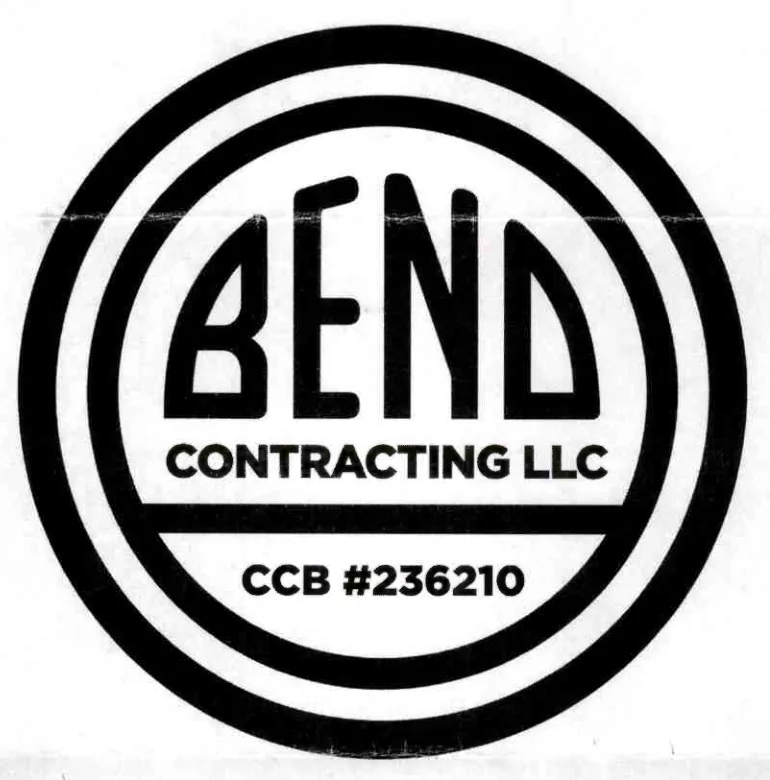
This 2021 Oregon filing shows a Bend letter device within a contracting company’s identity.
The attached specimen documents this particular commercial composition. It does not identify the origin of the historic emblem or the project’s common drawing.
Where it sits, and who put it there. The drawing is in none of the families, placed there by the curator on 16 September 2026 as a different font: the letters are re-set in a geometric sans of even weight and the word occupies the upper third of the disc over two lines of type rather than filling it. The character matrix disagrees and reads the Downtown file in all twelve characters — narrow letters clear of the ring, a notched B and a notched E at the same height, a capital N with its diagonal, an even last letter. What the curator is seeing is real and is not a character: the matrix scores how the letters are built and has nothing to say about how they are fitted. Both readings are the record.
Measured
Standing alone. This drawing is in none of the families: it is not evidence of one, and the record above says on what grounds it is out.
Read at high confidence from 222 px of letter, which is the letters alone, at this drawing's own letter cut.
Each drawing is reduced to the same thing — the letters BEND, cropped to their own ink, rasterised at a common size — so two of them can be compared by shape alone.
- Device aspect
- 0.992 The roundel’s width divided by its height. 1.000 is a true circle; anything else is an oval, or a photograph taken at an angle. 0.977 – 1.048 across the collection
- Word aspect
- 1.862 The same ratio for the block of BEND letters alone, once cropped to their own ink. 0.927 – 1.862; the high end is lettering set wide rather than stacked
- Figure ink
- 0.493 How much of the drawing is ink rather than ground. A heavy ring and fat letters push it up. 0.169 – 0.728, median 0.493
- Coverage
- 0.491 How much of the normalised square the letters fill once every drawing is reduced to the same size. 0.198 – 0.576, median 0.456
What it most resembles. Two digitisations of a single printing score 0.975, so that is what “the same artwork” looks like as a number.
- Deschutes Historical Museum, June 2020 0.516 — related letterforms, clearly redrawn
- The Bend Bulletin, November 1916 0.514 — related letterforms, clearly redrawn
- The same 1912 advertisement, from the page render 0.505 — related letterforms, clearly redrawn
Least like it: Bulletin business directory, August 1949, at 0.092.
Resemblance is not descent. A high score means two drawings have the same shape. It does not establish which came first, or that either was copied from the other.
Compare this drawing with another · The board · How the drawings were measured