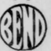
Two leaves, four corners, one drawing
Deschutes Historical Museum · Undated
This record carries no date and is not plotted along the story. The archive holds it.
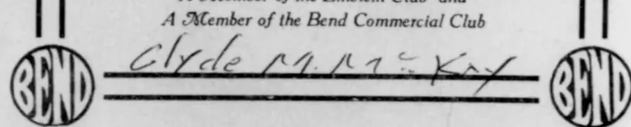
A printed item the museum holds, nobody has catalogued, and which carries the sharpest club-era drawing of the emblem this project has seen.
Between the curator's sentences the 2013 video shows two pages of something printed. Each has a photograph above and a caption below, and each has a BEND disc set into both bottom corners, about an inch and a half across on the page.
The first reads GROUP PORTRAIT / of / A Member of the Emblem Club and / A Member of the Bend Commercial Club, over a ruled line signed in ink. The signature is legible enough to read as Clyde M. McKay and is not further identified here. The second reads A RECEPTION COMMITTEE, under a photograph of twelve men in hats standing on rock beside a railroad track.
Nothing in the archive names this item. It is not the 1913 book, whose full text is transcribed here and which carries neither caption. Its two leaves are the same size, the same stock and the same layout, so they are almost certainly from one publication; what the publication is, who printed it and when are all open. A reception committee photographed beside a railroad track invites one obvious guess about which reception, and a guess is what it stays.
The drawing is the find. At this size the corners come to points, the last letter tapers, the E has three arms and the B's bowls meet in a notch — which is the construction of the 1912 advertisement, printed on something the club itself handed out.
Measured
The 1912 cut, the angular construction. Broad letters, a three-armed E, a capital N, and corners that taper to a point.
Read at medium confidence from 158 px of letter, which is an upper bound: this drawing's letters run into its ring, and no cut separates them.
Each drawing is reduced to the same thing — the letters BEND, cropped to their own ink, rasterised at a common size — so two of them can be compared by shape alone.
- Device aspect
- 1.000 The roundel’s width divided by its height. 1.000 is a true circle; anything else is an oval, or a photograph taken at an angle. 0.977 – 1.048 across the collection
- Word aspect
- 0.948 The same ratio for the block of BEND letters alone, once cropped to their own ink. 0.927 – 1.862; the high end is lettering set wide rather than stacked
- Figure ink
- 0.406 How much of the drawing is ink rather than ground. A heavy ring and fat letters push it up. 0.169 – 0.728, median 0.493
- Coverage
- 0.335 How much of the normalised square the letters fill once every drawing is reduced to the same size. 0.198 – 0.576, median 0.456
What it most resembles. Two digitisations of a single printing score 0.975, so that is what “the same artwork” looks like as a number.
- BendEmblem.com common master 0.439 — different drawings
- Deschutes County Fair edition, September 1925 0.430 — different drawings
- Bend Park Company, July 1912 0.425 — different drawings
Least like it: Bend Rubber Stamp & Printing, at 0.141.
Resemblance is not descent. A high score means two drawings have the same shape. It does not establish which came first, or that either was copied from the other.
Compare this drawing with another · The board · How the drawings were measured