
Home / Archive / July 28, 2016
A history page’s avatar, dated at last
Vintage Bend · July 28, 2016
In the story: 7. They got there, 2011–2021.
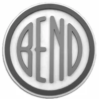
The clearest modern rendering of the emblem the sweep turned up belongs to a Facebook page about old Bend, and its own profile-picture history dates it.
Vintage Bend is a local-history page with about forty-four thousand followers, and its profile picture is the emblem: grey letters with a soft relief shadow, a heavy grey ring, on white. It is sharp, symmetrical and evidently drawn rather than photographed.
The research deliverable that found it could say nothing about when it was made, because Facebook does not show when a page's avatar was set. A page's profile-pictures album does. This one holds seven items, and three of them are the emblem: a black-ringed rendering on 28 March 2014, this one on 28 July 2016, and this one again on 26 September 2022.
So the drawing was in use no later than 28 July 2016, and the page was using some rendering of the emblem as its face from March 2014 — two years before the earliest date the deliverable could give anything of Vintage Bend's.
It is still worth nothing as evidence of the drawing's origin. Nobody has said who made it, the page states nothing about where the artwork came from, and an avatar is not an object. It is a clean rendering with a date, which is exactly what it is filed as.
Measured
The Downtown file, the notched construction. The same narrow letters and notched E as the bureau roundel, with a capital N.
Read at high confidence from 137 px of letter, which is the letters alone, at this drawing's own letter cut.
Each drawing is reduced to the same thing — the letters BEND, cropped to their own ink, rasterised at a common size — so two of them can be compared by shape alone.
- Device aspect
- 0.974 The roundel’s width divided by its height. 1.000 is a true circle; anything else is an oval, or a photograph taken at an angle. 0.977 – 1.048 across the collection
- Word aspect
- 0.974 The same ratio for the block of BEND letters alone, once cropped to their own ink. 0.927 – 1.862; the high end is lettering set wide rather than stacked
- Figure ink
- 0.530 How much of the drawing is ink rather than ground. A heavy ring and fat letters push it up. 0.169 – 0.728, median 0.493
- Coverage
- 0.427 How much of the normalised square the letters fill once every drawing is reduced to the same size. 0.198 – 0.576, median 0.456
What it most resembles. Two digitisations of a single printing score 0.975, so that is what “the same artwork” looks like as a number.
- Deschutes Brewery, Born in Bend 0.762 — a family resemblance, not the same cut
- City of Bend Neighborhoods, 2023 0.738 — related letterforms, clearly redrawn
- The City of Bend's current mark 0.684 — related letterforms, clearly redrawn
Least like it: Bend Rubber Stamp & Printing, at 0.180.
Resemblance is not descent. A high score means two drawings have the same shape. It does not establish which came first, or that either was copied from the other.
Compare this drawing with another · The board · How the drawings were measured
Seen in use
3 dated sightings, 2014–2022. Each is a record of this object or this drawing somewhere else.
- March 28, 2014 Vintage Bend · The page’s earlier avatar: a black ring round a graded disc Facebook profile picture · facebook.com A different rendering from the one filed, and not read as a separate drawing here: the album's copy is 480 px and the filed rendering is sharper.
- July 28, 2016 Vintage Bend · The relief rendering, set as the page’s avatar Facebook profile picture · facebook.com
- September 26, 2022 Vintage Bend · The relief rendering, set as the page’s avatar again Facebook profile picture · facebook.com