
Home / Archive / Contemporary use
Blue and gold on Downtown Bend’s history page
Downtown Bend Business Association · Contemporary use
This record carries no date and is not plotted along the story. The archive holds it.
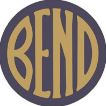
Broad letters fill the circle in the emblem displayed by the Downtown Bend Business Association.
This record was filed as a comparison for the project’s common version, and its id still says so, but measurement does not bear that out: against the common master it scores 0.372, ranking it sixteenth of twenty. It is closer to the 1912 and 1916 newspaper impressions (0.67) than to the drawing this site hands out. What it is close to is the gold file saved in 2022, at 0.959 — near-identity. The page does not identify the graphic’s designer or establish where the project’s received drawing came from.
The colours are worth a sentence. The Emblem Club’s own colours were blue and gold: its booth at Seattle’s Potlatch in July 1912 was “decorated throughout with blue and gold, the colors of the Emblem Club”, and the emblem filled the back of it as an electric transparency in the same two. This drawing is in blue and gold too. Nothing in this archive joins them — no chain of files, no brief, no statement by anybody who drew it — and the resemblance is recorded here as a resemblance.
Measured
The museum rounding, the rounded construction. The same rounded construction as 1917, with the last letter run straight down at one thickness instead of tapering.
Read at high confidence from 314 px of letter, which is the letters alone, at this drawing's own letter cut.
Each drawing is reduced to the same thing — the letters BEND, cropped to their own ink, rasterised at a common size — so two of them can be compared by shape alone.
- Device aspect
- 1.000 The roundel’s width divided by its height. 1.000 is a true circle; anything else is an oval, or a photograph taken at an angle. 0.977 – 1.048 across the collection
- Word aspect
- 1.015 The same ratio for the block of BEND letters alone, once cropped to their own ink. 0.927 – 1.862; the high end is lettering set wide rather than stacked
- Figure ink
- 0.463 How much of the drawing is ink rather than ground. A heavy ring and fat letters push it up. 0.169 – 0.728, median 0.493
- Coverage
- 0.456 How much of the normalised square the letters fill once every drawing is reduced to the same size. 0.198 – 0.576, median 0.456
What it most resembles. Two digitisations of a single printing score 0.975, so that is what “the same artwork” looks like as a number.
- Deschutes Historical Museum, 2012 0.962 — very close; the same drawing, or one traced from it
- Grayson Graham collection, gold, 2022 0.959 — very close; the same drawing, or one traced from it
- Downtown Bend Business Association badge, 2018 0.816 — a family resemblance, not the same cut
Least like it: Bulletin business directory, August 1949, at 0.166.
Resemblance is not descent. A high score means two drawings have the same shape. It does not establish which came first, or that either was copied from the other.
Ties touching this drawing, each in the class of evidence it has:
- Measured One artwork, two files. The museum’s February 2012 file and the roundel on Downtown Bend’s history page score 0.962 against each other and hold that score at every device cut. Which file came first is not measurable.
Compare this drawing with another · The board · How the drawings were measured