Home / Archive / Seen from June 9, 2026
A second disc, drawn by hand
The Bend Store · Seen from June 9, 2026
In the story: 8. Carrying it forward, since 2022.
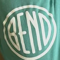
The Bend Store’s classic disc has been on its stickers since 2017. From June 2026 a second one is beside it: the same construction, drawn again by hand.
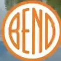
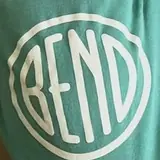
Two of the fifty-eight sightings filed against the shop’s classic disc do not show it. On 9 June 2026 a reel ends on the shop’s lockup with an orange-ringed disc in the middle of it, and on 5 July 2026 the same drawing is printed white on green baby onesies. Enlarged and set beside the sticker at one height, the difference is not in the letters’ construction but in the hand: the ring wobbles, every stroke is one even weight with a rounded end, and the B is wider.
Read against the character matrix at about a hundred and fifty pixels of letter, it is the Downtown file — narrow letters standing clear of the ring, a notched B and a notched E level with it, a capital N with its diagonal running the ordinary way, an even last letter. Same construction, different drawing, which is the ordinary case here: a family says two drawings are made the same way and never that one came from the other.
It is filed because the letters are redrawn. A sighting that shows the same artwork on another object is a row in the ledger, and fifty-six of the shop’s are; a sighting that shows different letters is a drawing, and gets a record, a crop and a reading. That line is the whole of why this page exists.
What this does not say: when the artwork was made, who made it, or whether it is meant to replace the disc the shop has used since 2017. Both are in use in 2026, and nothing located explains either.
Measured
The Downtown file, the notched construction. The same narrow letters and notched E as the bureau roundel, with a capital N.
Read at high confidence from 194 px of letter, which is an upper bound: this drawing's letters run into its ring, and no cut separates them.
Each drawing is reduced to the same thing — the letters BEND, cropped to their own ink, rasterised at a common size — so two of them can be compared by shape alone.
- Device aspect
- 1.000 The roundel’s width divided by its height. 1.000 is a true circle; anything else is an oval, or a photograph taken at an angle. 0.977 – 1.048 across the collection
- Word aspect
- 0.976 The same ratio for the block of BEND letters alone, once cropped to their own ink. 0.927 – 1.862; the high end is lettering set wide rather than stacked
- Figure ink
- 0.524 How much of the drawing is ink rather than ground. A heavy ring and fat letters push it up. 0.169 – 0.728, median 0.493
- Coverage
- 0.426 How much of the normalised square the letters fill once every drawing is reduced to the same size. 0.198 – 0.576, median 0.456
What it most resembles. Two digitisations of a single printing score 0.975, so that is what “the same artwork” looks like as a number.
- Bend Chamber of Commerce, June 1953 0.448 — different drawings
- The same 1912 advertisement, from the page render 0.439 — different drawings
- The Bend Bulletin, November 1916 0.438 — different drawings
Least like it: Bend Rubber Stamp & Printing, at 0.192.
Resemblance is not descent. A high score means two drawings have the same shape. It does not establish which came first, or that either was copied from the other.
Compare this drawing with another · The board · How the drawings were measured
Seen in use
2 dated sightings, 2026. Each is a record of this object or this drawing somewhere else, and where a picture is hosted it is a documentary crop of the object, credited to whoever holds it.
-
 June 9, 2026 The Bend Store · Reel end card: the shop’s lockup with an orange-ringed disc, over a river scene Digital graphic · instagram.com The Bend Store; documentary reproduction at documentary size for commentary, with attribution and a link. Source: https://www.instagram.com/reel/DZX3P_xj-j7/
 -
 July 5, 2026 The Bend Store · Baby onesies with a BEND disc print Photograph of the object · instagram.com As with the beanies six weeks earlier: the rounded-branch reading is the research deliverable’s and is not adopted here. The Bend Store; documentary reproduction at documentary size for commentary, with attribution and a link. Source: https://www.instagram.com/p/Daa_ckbxfpl/